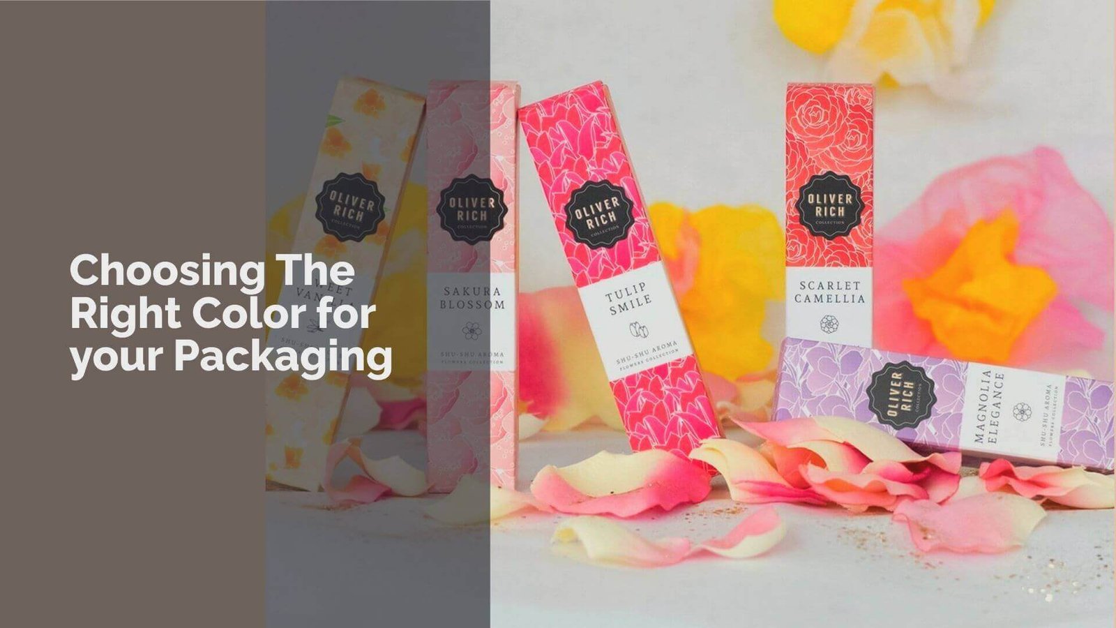
Choosing the right color for your packaging is crucial as it influences customer perception and brand identity.
Colors play a big role in how people feel about your product. The right color can attract buyers and make your brand stand out.
In this article, we will explore the psychology behind packaging colors and how they can affect your brand success.
Understanding color schemes will help you make smart choices that connect with your audience and reflect your brand image.
Importance Of Choosing The Right Color Scheme For Your Packaging
Choosing the right color scheme for your packaging is very important. It can make your product stand out and attract customers.
The colors you choose can show what your brand is about and help people remember it.
When customers see your packaging, they should feel excited and curious about what’s inside. Using the right colors can also create a strong connection with your audience, making them more likely to buy from you.
Overall, a thoughtful color choice can lead to better sales and a stronger brand image in the market.
Psychology Behind Packaging Colors
Colors are powerful tools that can make or break your product’s success. They speak directly to customers’ emotions and can influence buying decisions instantly.
The right color can attract attention, create trust, and make your brand memorable.
Understanding color psychology helps you choose packaging that connects with your target audience and tells your brand’s unique story.
White Packaging
White packaging represents simplicity and purity. Brands like Apple use white to showcase clean, modern design. It communicates product safety and traditional values.
White creates a sense of openness and can make products look fresh and straightforward. When used strategically, white packaging can make other colors pop and draw attention to important design elements.
Apple’s minimalist white packaging has become iconic, showing how a simple color choice can define a brand’s entire identity.
Black Packaging
Black packaging screams luxury and sophistication. Brands like Zara and Coach use black to convey high-end quality. It represents strength and authority, making products look more expensive and exclusive.
Black packaging works especially well for premium products, creating an immediate perception of elegance.
The color can be enhanced with metallic accents like gold or silver to increase the feeling of luxury. When used correctly, black packaging can transform a product from ordinary to extraordinary.
Blue Packaging
Blue packaging symbolizes reliability and trust. Brands like Gillette and Pepsi use blue to communicate dependability. It’s considered one of the safest colors across different age groups and genders.
Darker blue shades appeal to older audiences, while lighter blues attract younger customers. Blue conveys calmness and professionalism, making it perfect for healthcare, technology, and service industries.
The color provides objective connotations across cultures, making it a versatile choice for global brands.
Brown Packaging
Brown packaging represents natural and earthy qualities. It communicates authenticity and sustainability, making it popular for organic and eco-friendly products.
Brands like Kraft use brown to show their commitment to natural materials. The color suggests reliability and groundedness, connecting products to traditional and wholesome values.
Brown packaging works well for food, agricultural, and handmade products, creating a sense of warmth and genuineness.
Red Packaging
Red packaging is all about excitement and energy. Brands like Coca-Cola use red to trigger impulse buying and create urgency.
It represents passion and intensity, making products look dynamic and attention-grabbing. Red is perfect for limited edition items and products targeting adventurous consumers.
In food packaging, red can make products seem sweeter and more flavorful. The color is universally associated with love, danger, and celebration.
Green Packaging
Green packaging symbolizes health and nature. Brands like Subway use green to communicate eco-friendliness and organic qualities.
It represents growth and harmony, making it ideal for sustainable and wellness products. Darker green shades suggest luxury, while muted greens indicate safety and nutrition.
Green packaging can make products appear healthier and more natural. It’s particularly effective for food, beverage, and environmental brands.
Gray Packaging
Gray packaging communicates sophistication and neutrality. It represents professionalism and balance, making it popular in technology and design industries.
Gray can make products look modern and sleek, bridging the gap between traditional and contemporary styles.
Brands like Apple often use gray to create a sense of understated elegance. The color works well for products targeting professional and discerning consumers.
Orange Packaging
Orange packaging represents fun and adventure. Brands like Fanta use orange to communicate friendliness and confidence. It’s associated with exploration and optimism.
Orange can be challenging to use but incredibly effective when done right. It works well for products targeting energetic and extroverted audiences. Orange packaging can make products look playful and approachable.
Yellow Packaging
Yellow packaging symbolizes optimism and innovation. Brands like McDonald’s and Lego use yellow to create fun and energetic vibes.
It’s particularly effective for products targeting children and adolescents. Yellow suggests creativity and happiness, making products look original and exciting. It can instantly lift mood and create a sense of positivity.
Turquoise Packaging
Turquoise packaging represents calmness and clarity. Brands like Tiffany use it to communicate purity and cleanliness.
It’s perfect for health and cleaning products, suggesting freshness without being sterile. Turquoise creates a sense of tranquility and mental clarity, making products look refreshing and pure.
Purple Packaging
Purple packaging symbolizes luxury and creativity. It represents sophistication and mystery, making products look premium and unique.
Brands can use purple to target audiences seeking something special and high-end. Darker purples suggest exclusivity, while lighter shades communicate playfulness. Purple works well for creative and artistic products.
Pink Packaging
Pink packaging represents beauty and femininity. Brands like Barbie use pink to communicate empathy and sincerity.
Different shades target different audiences – soft pinks for mature markets, bright pinks for younger consumers. Pink can make products look approachable and emotional, creating a sense of care and gentleness.
Science Behind Color Psychology
Color psychology studies how colors affect our feelings and behaviors. Different colors can evoke specific emotions; for example, blue promotes trust, while red sparks energy and urgency.
Understanding this science is crucial for choosing the right packaging colors. When brands apply color psychology effectively, they create packaging that resonates with customers and encourages purchases.
By selecting colors that align with their brand message, businesses can enhance their image and attract more buyers. Ultimately, the right color choices can lead to better sales and a stronger connection with the audience.
Understanding Color Schemes
Understanding color schemes is essential for creating effective packaging. The right color combinations can enhance your brand’s message and attract customers.
By using various techniques, such as high-contrast colors and the color wheel, you can design packaging that stands out and communicates effectively.
Choosing the right colors helps create a memorable experience for your audience, making it easier for them to connect with your brand.
High-Contrast Colors Make Design Elements More Noticeable
High-contrast colors are two or more colors that are very different from each other. This design principle is important for product packaging because it helps certain elements stand out, like text or logos.
For example, dark blue works well with bright yellow because they are easy to see together. High contrast makes your packaging eye-catching and ensures that important information is clear to customers.
Avoid using colors that are too similar, like yellow and orange, as they can blend together and confuse buyers. Using high-contrast colors is a simple way to improve your packaging design.
The Color Wheel Is a Valuable Source of Color Technique Ideas
The color wheel is a helpful tool for choosing packaging colors that express your brand’s personality.
It shows how different colors relate to each other and can guide you in selecting combinations that work well together.
When designing your packaging, try to limit yourself to two or three colors; using too many can overwhelm customers.
For example, if you choose blue as your main color, you might pair it with yellow for a fresh look. The color wheel helps you create a balanced and appealing design that attracts attention.
Complementary Colors
Complementary colors are opposite each other on the color wheel, like blue and orange. Using these colors together creates strong contrast, making your packaging vibrant and eye-catching.
For instance, brands like Pepsi use blue and red to stand out on shelves. This technique is great for grabbing attention and making important details pop.
Split Complementary Colors
Split complementary colors involve using one base color and two adjacent colors from its opposite side on the color wheel.
For example, if blue is your base color, you might choose red-orange and yellow-orange as your supporting colors.
This combination adds variety while still maintaining harmony in your design. Brands like Dunkin’ Donuts use this technique to create fun and engaging packaging.
Analogous Colors
Analogous colors sit next to each other on the color wheel, like red, orange, and yellow. This combination creates a smooth flow and a cohesive look in your packaging design.
Brands like Tropicana use analogous colors to convey freshness and warmth in their juice products. This approach helps create a pleasing visual experience for customers.
Monochromatic Colors
Monochromatic colors use variations of a single hue by adding tints (lightening), shades (darkening), or tones (mixing gray).
This technique creates a clean and sophisticated look for packaging. Brands like Apple often use monochromatic schemes to convey elegance and simplicity in their products.
A monochromatic design can make your packaging feel modern while still being visually appealing.
Triad, Tetradic, or Square Colors
Triad colors consist of three evenly spaced colors on the color wheel, while tetradic (four colors) and square combinations provide balance with contrasting hues.
These schemes are great for brands looking to make bold statements while maintaining harmony in their designs.
Brands like LEGO use triadic schemes to create playful yet balanced visuals that attract children and adults alike.
Tints, Shades, and Tones Create Variations of Hues on the Color Wheel
Tints, shades, and tones add depth to your packaging design by creating variations of a single hue. A tint is made by adding white to a color, making it lighter; this can give a fresh look perfect for minimalist designs.
A shade is created by adding black, resulting in darker tones that convey elegance or sophistication—think of luxury chocolate brands using deep brown shades.
A tone is formed by mixing gray with a hue, softening its intensity; this can create a calm effect suitable for health-related products. Using these variations helps convey different messages through your packaging design effectively.
How Packaging Colors Can Affect Your Brand Success?
Packaging colors play a vital role in your brand’s success. The right colors can attract customers and create a strong first impression.
For example, bright colors like red can grab attention and make products feel exciting, while blue can convey trust and reliability.
This emotional connection influences purchasing decisions, as studies show that up to 90% of consumers make choices based on color alone.
Additionally, consistent color choices help build brand recognition, making it easier for customers to remember your products.
By understanding color psychology and using it wisely, you can enhance your brand image and foster customer loyalty.
Choosing the right color for your packaging can greatly impact your brand’s success. To learn more about this, check out our blog on choosing the right custom packaging manufacturer for tips on finding the best partner for your packaging needs.
How To Choose The Right Color For Your Packaging?
Choosing the right color for your packaging is essential for attracting customers and building your brand. The colors you select can influence how people feel about your product and whether they decide to buy it.
By considering factors like core brand colors, audience preferences, and cultural meanings, you can make smart choices that reflect your brand’s identity.
This guide will help you understand how to choose the best colors for your packaging to create a strong impact and connect with your customers effectively.
Stick to Core Brand Colors
Sticking to core brand colors is crucial for maintaining consistency in your packaging. These core brand colors represent your brand’s identity and values.
For example, if your brand is known for being eco-friendly, green might be a core color that reflects this commitment.
Using these colors across all products helps customers recognize your brand easily. Consistency builds trust and loyalty, making it more likely that customers will choose your products again.
Brands like Starbucks effectively use green to reinforce their identity as a coffee shop focused on sustainability.
Use Main Brand Colors
Using your main brand colors in packaging is important for creating a strong visual connection with customers.
These colors should be prominent in your design, as they help convey your brand message. For instance, Coca-Cola uses red prominently in its packaging to evoke feelings of excitement and energy.
When customers see these colors, they instantly associate them with the brand. By incorporating main brand colors into your packaging, you create a memorable experience that encourages customer loyalty and recognition.
Think About Brand Image
When choosing packaging colors, consider how they reflect your brand image. Your packaging should communicate what your brand stands for and how you want customers to perceive it.
If you want to appear luxurious, using black or gold can convey sophistication. On the other hand, bright colors like yellow or orange can suggest fun and playfulness.
For example, luxury brands like Chanel use black and white to create an elegant image. Understanding how colors relate to brand image helps create a cohesive look that attracts the right audience.
Think About Product Place
Consider where your product will be displayed when choosing packaging colors. The environment can greatly influence how colors are perceived.
For example, if your product is sold in a grocery store, bright colors can help it stand out on crowded shelves. In contrast, if it’s sold online, consider how the colors will look in photos on eCommerce sites.
Brands like Lay’s use bright yellow packaging to catch attention in stores while also looking appealing online. Tailoring your color choices based on the product place ensures maximum visibility and appeal.
Show Who You Are
Your packaging should reflect who you are as a brand. Use colors that represent your values and personality. For example, if you focus on creativity and innovation, vibrant and unique color combinations can showcase this aspect of your brand.
Brands like Ben & Jerry’s use playful colors to show their fun and quirky personality. By showing who you are through color choices, you create a stronger connection with customers who share similar values or interests.
Show What You Sell
Colors can also indicate what you sell through visual cues. For instance, green often signifies health or organic products, while brown can represent natural or rustic items.
By choosing packaging colors that align with the nature of your product, you help customers understand what they can expect before even opening the package.
A brand like Tropicana uses orange to signify freshness in its juice products. This approach makes it easier for customers to identify what they are buying at a glance.
Understand Your Buyers
Understanding your buyers is key when selecting packaging colors. Different demographics may respond differently to certain colors based on their preferences and cultural backgrounds.
For example, younger audiences may prefer bold and bright colors, while older consumers might lean toward more muted tones.
Conducting market research helps identify which colors resonate with your target audience. Brands like Nike understand their audience well and use dynamic colors that appeal to active consumers.
Think About Your Audience
Always consider who will be buying your product when choosing packaging colors. Different audiences have different preferences based on age, gender, and lifestyle.
For example, pastel colors may appeal more to children’s products, while sleek black might attract adults looking for luxury items.
Understanding these preferences helps create packaging that speaks directly to your audience’s tastes and desires. Brands like Barbie use bright pinks to attract young girls effectively.
Use Colors for Feelings
Colors evoke emotions that can influence purchasing decisions. For example, blue often conveys trust and calmness, while red can create excitement or urgency.
By using specific colors strategically in your packaging design, you can evoke desired feelings in potential buyers.
Brands like Target use red to create a sense of urgency during sales events. Knowing which emotions different colors evoke allows you to select hues that align with the feelings you want customers to associate with your products.
Think About Culture Choices
Cultural differences can greatly affect how people perceive color. For instance, while white symbolizes purity in Western cultures, it may represent mourning in some Eastern cultures.
When designing packaging for global markets, it’s essential to understand these cultural meanings to avoid misunderstandings or negative perceptions of your brand.
Brands like McDonald’s adapt their packaging designs based on regional preferences to ensure they resonate well with local audiences.
Be Different from Others
Standing out from competitors is crucial in today’s crowded market; using unique color combinations can help achieve this goal.
Avoiding common color schemes allows your product to capture attention more effectively on store shelves or online listings.
Brands like Fanta use bright orange packaging to differentiate themselves from other soda brands that may use similar color palettes.
Being different helps create a memorable impression that encourages consumers to choose your product over others.
Think About Material Hues
Consider the material of your packaging when selecting colors; certain materials may affect how colors appear or are perceived by consumers.
For example, matte finishes might soften bold hues while glossy surfaces can enhance brightness and vibrancy.
Choosing materials that complement your color choices enhances the overall look of your packaging design; brands like Apple use sleek materials combined with simple color schemes to convey modernity and elegance effectively.
Keep It Simple
Simplicity is key when choosing packaging colors; too many competing hues can overwhelm customers and dilute the message of your product.
Sticking with two or three main colors creates a clean look that’s easy for consumers to understand at first glance; this approach helps ensure that important information stands out clearly without distractions from excessive detail or complexity in design elements.
Stay The Same with Style
Consistency across all products is vital for building a recognizable brand identity; using similar color schemes helps reinforce this connection among different items within a line or collection effectively over time!
Brands like Coca-Cola maintain consistent red branding across various products—cans or bottles—to ensure instant recognition regardless of where customers encounter them!
Staying true to style fosters familiarity among loyal buyers who appreciate knowing exactly what they’re getting each time they purchase from you!
Packaging Colors By Industry
In the food and beverage industry, colors like red and green are very popular. Red is often used to grab attention and stimulate appetite, making it common in fast food packaging like McDonald’s.
Green is associated with health and organic products, making it ideal for brands like Whole Foods. Yellow is another color that suggests energy and happiness, often seen in snack foods.
For example, brands like Lay’s use bright yellow to attract customers. Using these colors helps customers quickly identify what they’re buying and influences their choices based on their preferences for health or excitement.
Cosmetics
In the cosmetics industry, color choices often reflect the target audience’s gender and age. Brands targeting women frequently use pinks and pastels to create a soft and inviting look, as seen with brands like Benefit Cosmetics.
For men, darker colors like blue or black are popular for products like shaving cream or colognes.
Colors can also indicate product ingredients; for example, black packaging is often used for products with activated charcoal.
Bright colors like yellow or orange can suggest freshness or energy in beauty products. Understanding these nuances helps brands connect with their audience effectively.
Retail
In retail, the choice of packaging colors depends on both the product type and brand identity. Bright colors can attract attention on crowded shelves, while muted tones may convey sophistication for luxury items.
For example, Tide uses bold orange packaging to stand out among laundry detergents, while Canon uses red and white to represent quality in their cameras.
The color scheme can also indicate the product’s purpose; for instance, blue might suggest reliability in electronics. By using strategic color choices, retailers can create a strong brand presence that resonates with consumers.
Electronics
In the electronics industry, packaging typically features neutral colors like black, white, and gray to convey modernity and professionalism.
Brands like Apple use sleek white packaging to emphasize simplicity and elegance. However, some companies add vibrant pops of color to stand out in a competitive market; for example, gaming brands may use neon colors to attract younger audiences.
Metallic shades are also popular as they reflect cutting-edge technology. By understanding how color impacts consumer perception, electronics brands can design packaging that appeals to their target market effectively.
Where To Buy Best Custom Packaging?
If you’re looking to buy the best custom packaging, 7 Custom Boxes is an excellent choice. We specialize in creating unique packaging solutions that cater to your specific needs.
Our team understands the importance of high-quality materials and eye-catching designs that reflect your brand identity.
We offer a wide range of options, from eco-friendly materials to various box styles, ensuring you find the perfect fit for your products.
In addition to our customization options, we provide exceptional customer service and fast turnaround times.
Whether you’re a small business or a large corporation, we can help you create packaging that stands out and enhances the unboxing experience for your customers.
With 7 Custom Boxes, you can trust that your packaging will be both functional and visually appealing, making a lasting impression on your audience.

